

I spend more time than I probably should thinking about color palettes for weddings.
The way they connect the flowers to the table settings and then carry over to the bridesmaids and invitations feels really satisfying when it works.
Sophisticated shades in particular give a sense of calm and intention that I appreciate.
It is not about being perfect.
Sometimes I change my mind halfway through but these kinds of ideas help me stay grounded in what I actually like.
Terracotta and Dusty Blue Charm
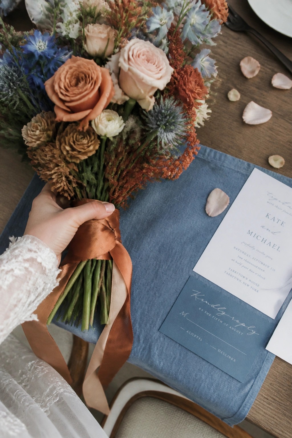
A hand in white lace holds a bouquet of terracotta roses and peach blooms. Blue delphiniums and thistles add cool contrast to the warm tones. A dusty blue linen napkin supports a crisp white invitation and matching RSVP card. Scattered rose petals rest on the dark wooden table surface. The overall style feels elegant and timeless with a natural romantic mood.
I adore how these colors blend warmth and calm so effortlessly. This palette creates a sophisticated look that feels both fresh and inviting. It inspires me to mix bold florals with soft linens for a truly memorable wedding day.
Sage Green and Peach Wedding Palette

A wooden table is dressed with a soft sage green linen runner. White plates sit stacked beneath a loosely knotted sage napkin. A delicate menu card rests on the plates. Gold cutlery is arranged neatly on either side. Several candles flicker in clear glass holders. An abundant floral garland stretches across the table with white roses and peach dahlias. The overall style is refined and romantic with gentle natural light.
This palette feels calm and elegant to me. The sage green grounds the warmer peach tones beautifully. I love how the combination brings a serene sophistication to the entire setting. It works seamlessly for linens florals and stationery alike.
Muted Mauve Blush and Gray for Sunset Romance

Three bridesmaids stand together on a stone terrace at golden hour. The woman on the left wears a strapless mauve gown while holding a lush bouquet of roses and greenery. The central figure smiles in a flowing blush pink dress with delicate straps and carries a large matching arrangement. The woman on the right appears in a soft gray gown with a side slit and holds a similar floral bouquet. Warm sunlight illuminates the scene against a backdrop of rolling hills and vineyards. The overall mood feels joyful and elegant with sophisticated pastel tones.
I adore the way these soft hues create harmony without overpowering the natural light. The palette feels fresh yet timeless for any outdoor celebration.
White And Black Sophistication

The photo shows an outdoor wedding aisle lined with white folding chairs. Each chair features a full bouquet of white hydrangeas tied with a long black ribbon. A dark gray runner stretches down the center toward a flower covered arch. Guests sit facing forward under a bright sky with soft clouds. The overall style is clean and modern with a serene mood.
I love the striking contrast of pure white against rich black. This palette feels both fresh and timeless at the same time. It creates an elegant backdrop that lets the florals shine.
Serene Blue And Blush Coastal Palette

The scene shows a light blue envelope with elegant calligraphy. An invitation with a watercolor beach illustration rests on neutral linen. Blush carnations and dried grasses are tied with a sheer blue ribbon. A seashell stamp adds a coastal detail. The style is refined and beach inspired with soft pastels.
I adore how these muted blues create a calm foundation. The blush florals add warmth and romance. This combination feels timeless for a seaside celebration.
Blush Pink and Emerald Wedding Cake

A three tiered cake rises elegantly on the table. Smooth ivory frosting covers each layer with subtle ridges. Pink roses in shades of blush and berry nestle among green foliage. The display sits atop rich emerald velvet fabric. A flowing pink satin ribbon adds a soft accent at the base. Golden string lights create a warm glow in the evening setting.
I love how this palette mixes gentle blush florals with deep green linens. The soft pinks bring romance while the emerald adds depth and sophistication. This look feels timeless yet fresh for any elegant celebration.
Twilight Garden Table with Yellow and Blue Accents

Guests sit along a long wooden table in a lush backyard at dusk. String lights cast a warm glow over the scene. Mustard yellow napkins and dark blue glassware create a refined contrast. Wildflower centerpieces feature sunny yellow blooms and white daisies. The overall style feels rustic yet elegant with natural textures and soft lighting. I love the way these colors blend earthy warmth with sophisticated depth. This palette makes the entire setup feel timeless and inviting for a wedding celebration. It inspires me to mix bold florals with simple linens for memorable outdoor events.
Lavender and Blush Bouquet

A close up reveals a wedding bouquet. Lavender roses mingle with blush pink roses. White blooms and green eucalyptus leaves fill the gaps. A matching lavender ribbon wraps the stems. The style feels romantic and refined. Soft light highlights the muted color palette.
I love how these gentle tones create calm elegance. This combination feels timeless for any sophisticated celebration.
Graceful Neutrals and Fresh Greenery

A formal table is set for a wedding reception. White linens drape the surface. White plates hold folded gray napkins. Silverware lies neatly beside each plate. White pillar candles flicker in tall glass holders. A runner of lush green foliage stretches along the center. An RSVP card sits in the foreground. The overall mood is calm and refined. The style blends natural elements with elegant simplicity. The color palette features soft gray, crisp white, and sage green.
This palette inspires me with its timeless charm. The neutral tones feel both fresh and sophisticated. I love how the greenery adds organic warmth. The look suits a serene and memorable celebration.
Warm Peach and Taupe Palette

A woman kneels gracefully on a plush carpet. She wears a flowing taupe bridesmaid dress. Her hands gently touch a soft peach gown on the rack. Rows of dresses display shades of peach coral and earthy brown. A bouquet of blush roses rests on a nearby chair. Natural light fills the elegant room with a serene mood. The overall style feels refined and cohesive.
I adore this palette for its timeless warmth. It brings a sophisticated harmony to the bridesmaids. The soft neutrals create an inspiring and romantic setting.
Lavender and Gray Garden Elegance

A stone pathway stretches toward a grand arch draped in soft lavender fabric. Floral arrangements in shades of purple and white line the aisle. Bridesmaids wear flowing lavender gowns while holding matching bouquets. Groomsmen stand in tailored gray suits on the opposite side. The bride appears in a classic white gown with a long veil. The groom wears a light gray suit beside her. Golden sunlight glows through the trees creating a warm serene mood. White chairs hold seated guests in formal attire.
I find this palette truly inspiring because the gentle lavender tones blend seamlessly with gray suits and natural greenery. The combination feels both romantic and refined for an outdoor ceremony. It shows how florals and linens can create harmony without overpowering the setting. This look motivates me to explore similar soft hues for future wedding designs.
Burgundy and Gold Romance

A round table is covered in deep burgundy linen. Dark wooden chairs with cream cushions are arranged around it. Gold charger plates hold printed menus and stationery. A lush centerpiece overflows with blush and burgundy roses. Lit candles cast a warm glow across the place settings. A framed sign in the background shares the couple’s initials and date. The style feels intimate and refined with rich autumn tones.
I love how this palette mixes bold burgundy with soft gold. It creates a warm and elegant mood for an evening celebration. The florals and linens together make the whole table feel timeless.
Pastel Palette on the Beach

Three barefoot bridesmaids stroll along the shoreline. They wear flowing gowns in soft aqua beige and coral. Each carries a bouquet of white and blush roses. Bright sunlight illuminates the scene with a warm glow. The ocean stretches out under a clear sky. The mood feels joyful and serene.
I love how these hues echo the natural surroundings. They create an elegant yet relaxed atmosphere. This palette inspires fresh ideas for seaside weddings.
Rustic Barn Wedding with Sage and Peach Tones

A long wooden table fills a cozy barn venue. Green linen napkins hold elegant floral stationery cards. Mixed glass goblets appear in shades of green and clear crystal. A soft peach runner stretches along the center beside fresh daisy and rose arrangements. Warm string lights glow overhead to create an intimate atmosphere. The overall style blends rustic wood with natural earthy colors.
I find this palette so inspiring because the sage greens pair beautifully with blush accents. It creates a sophisticated yet welcoming feel for any barn celebration. The natural elements make the whole setting feel timeless and romantic.
Navy And Copper Stationery

The photo shows a wedding invitation suite in navy blue and copper. A white card with the names Elizabeth and Jonathan sits on layered envelopes. A navy ribbon and copper wax seal add detail. Two lit copper candle holders glow nearby. Navy gift boxes with thank you tags complete the scene. A city skyline appears in the background. The overall style is modern and luxurious.
I love how these colors feel both timeless and fresh. The metallic copper adds warmth to the deep navy. This combination creates an elegant mood for any celebration.
Soft Peach and Sage Green

A delicate bridal bouquet lies on a light wood floor. White ranunculus and coral peach roses form the heart of the arrangement. Soft greenery and tiny white blooms add natural texture throughout. Sage green fabric drapes beside the bouquet with an ivory linen accent pinned at the top. The overall style feels romantic and refined with a gentle earthy touch.
I adore the way these hues create such a calm and elegant mood. The soft peach tones bring warmth while the sage green adds depth and sophistication. This palette feels timeless and perfect for a refined celebration.
Earthy Coastal Elopement Inspiration

The scene shows a crusty loaf of bread partially covered by soft beige linen. A light blue card rests on the table announcing an elopement in Big Sur California. Pink ranunculus and white blooms sit beside a small seashell. A rustic wooden fence frames the ocean waves and sandy beach in the background. The mood feels intimate and serene with natural styling and a palette of neutrals soft pinks and ocean blues.
This idea inspires me because it captures effortless sophistication through simple natural elements. The warm bread and cool card create a personal focal point that feels both grounded and romantic. I love how the coastal setting elevates the entire color story without any fuss.
Navy And Blush For Classic Sophistication

A three tier white cake rests on a marble table. Navy ribbon wraps elegantly around the middle tier. Blush pink roses and white blooms decorate the top and base. Folded place cards sit neatly in rows nearby. String lights glow warmly in the background. The overall mood is romantic and refined. The color palette blends crisp white with deep navy and soft blush.
I love this palette because the navy adds depth while blush keeps everything gentle and fresh. It creates a timeless look that works beautifully for florals and stationery alike.
Warm Terracotta With Linen Neutrals

The scene features a long table covered in crisp white linen. Terracotta pots hold folded beige napkins tied with twine and accented by fresh greenery. Soft evening light highlights the earthy orange brown of the pots against lush green foliage in the background. Clear glassware lines the table creating a simple and refined outdoor tablescape. The overall style blends rustic charm with sophisticated minimalism in a warm neutral palette.
I adore the way these terracotta vessels add organic texture and warmth to the setting. This palette feels timeless and grounded while still elegant enough for a special day. It inspires me to incorporate similar natural elements into my own wedding plans.
Frequently Asked Questions
Q: How do I make sure the same colors work across flowers, linens, and bridesmaid dresses without clashing? A: Start with one dominant shade and pick two supporting tones that appear in multiple elements. Hold fabric swatches next to real flower samples in daylight to check how they play off each other.
Q: What if the stationery ends up looking too matchy with the rest of the palette? A: Let the paper use a softer version of one accent color instead of copying everything exactly. This keeps the invites tied in while giving them their own feel.
Q: Can I tweak the palette once I start seeing actual samples? A: Yes, swap in a close shade if something looks off in person. Just keep the main color steady so the overall scheme stays consistent.
Q: How do I handle different skin tones among the bridesmaids with these colors? A: Choose mid-tone shades like dusty rose or sage that tend to flatter a range of complexions. Ask each person to try on a small swatch before ordering dresses.